| Green Space Access Research | |
|
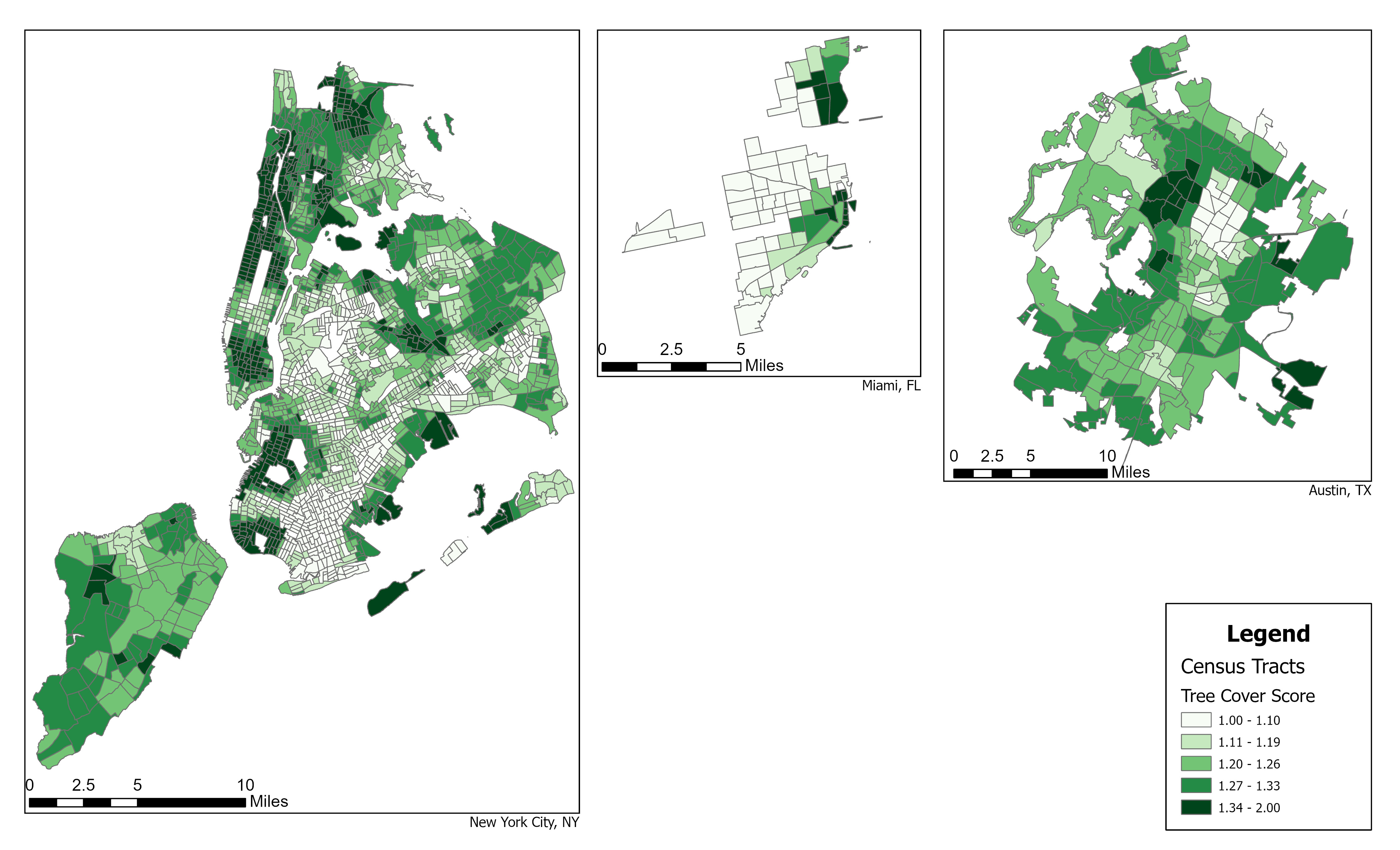
This map is part of a research paper I wrote for Geo Data Science and Health class. It is about how access to green space impacts certain health outcomes at the community level, namely cancer prevalence and high blood pressure. I created this map by downloading tree canopy cover data sets and converting them into polygons to assess resident access to green space within one mile. The tree cover score is an average of nearby green space tree canopy cover density. |
| Automated Electronic Waste Estimation Tool | |
|
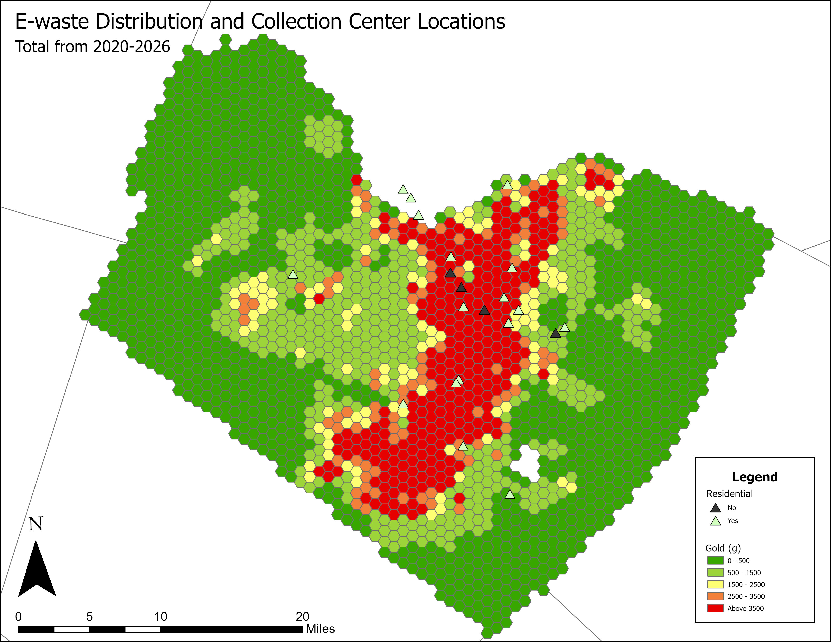
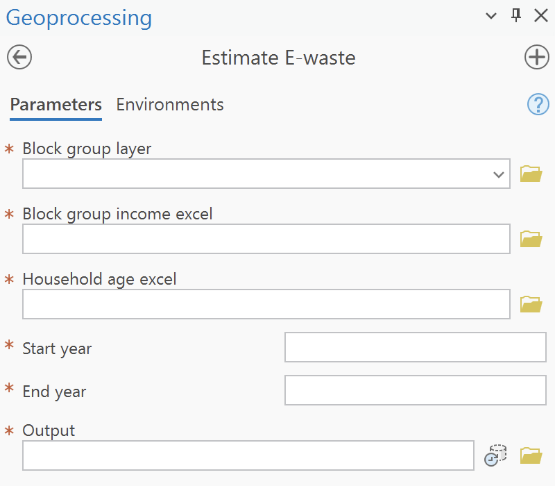
Several population and consumer data sets were compiled into a Python program I wrote to estimate potential electronic waste generation at the household level across Travis County, Texas. The total material mass from nine different electronic waste categories was calculated at the Census block group level and aggregated into regular one-mile hexagons using summary statistics. This reveals the true distribution of gold being generated by electronic waste, which residential e-waste collection centers can utilize. The program was also converted into a custom ArcGIS tool to automate the process. |
|
|
| Respondent Mapping | |
|
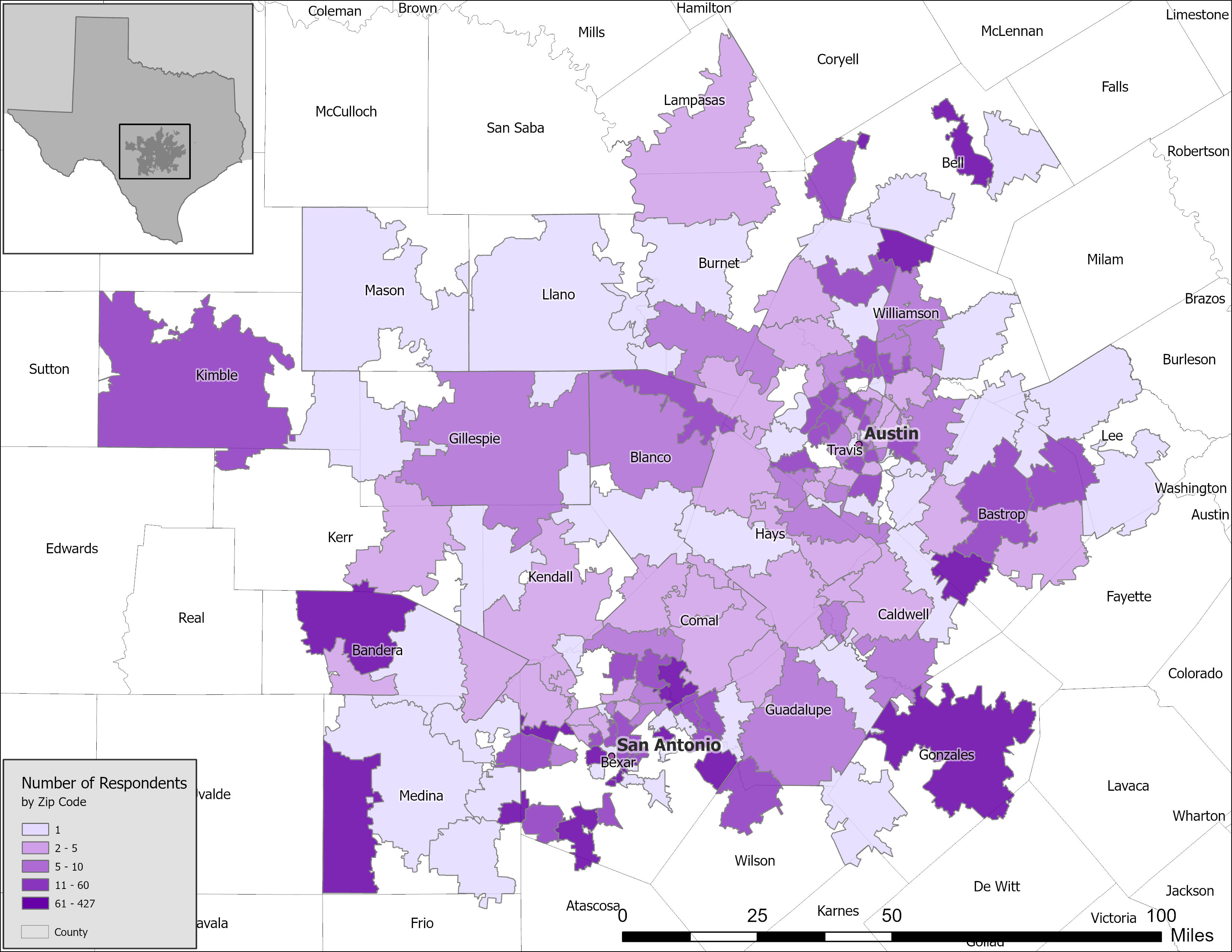
This map was created for a survey research paper I helped with that will soon be published. I used the counts by zip code of our respondents from our Excel dataset to create this map. The location and distribution of the survey respondents was used to understand potential bias in later statistical analysis. |
| Litter Mapping with Survey123 | |
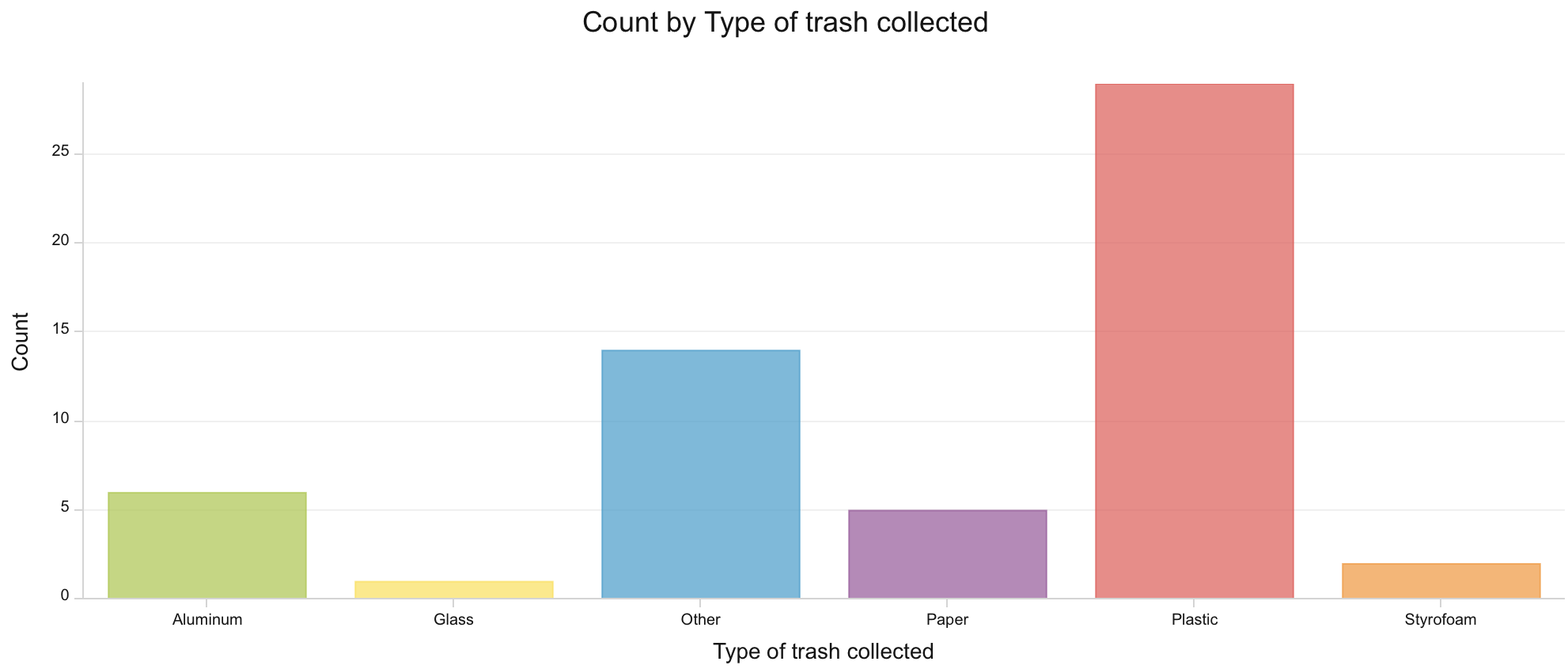
| This is a prototype of a litter collection project made with Survey123, ArcGIS Pro, and ArcGIS Online. Volunteers would be able to use the Survey123 app to report the type and location of litter as they clean up an area. The idea was to identify litter hotspots and gain insights on their movement in the environment. | |
|
|
| Mapping the Pattern of Urban Employment Change | |
|
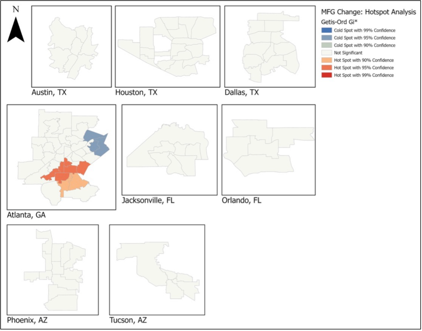
This map was created for my final paper in Health Geography. It assess whether or not there is a statistically significant spatial correlation between the city subdivisions experiencing potential changes in manufacturing employment rates. Within Atlanta, the urban core is experiencing a growth in manufacturing employment while the periphery is experiencing a decline. Other cities may have had too few subdivisions to reach statistical significance. |
| Fire Stations with Shorter Response Times | |
|
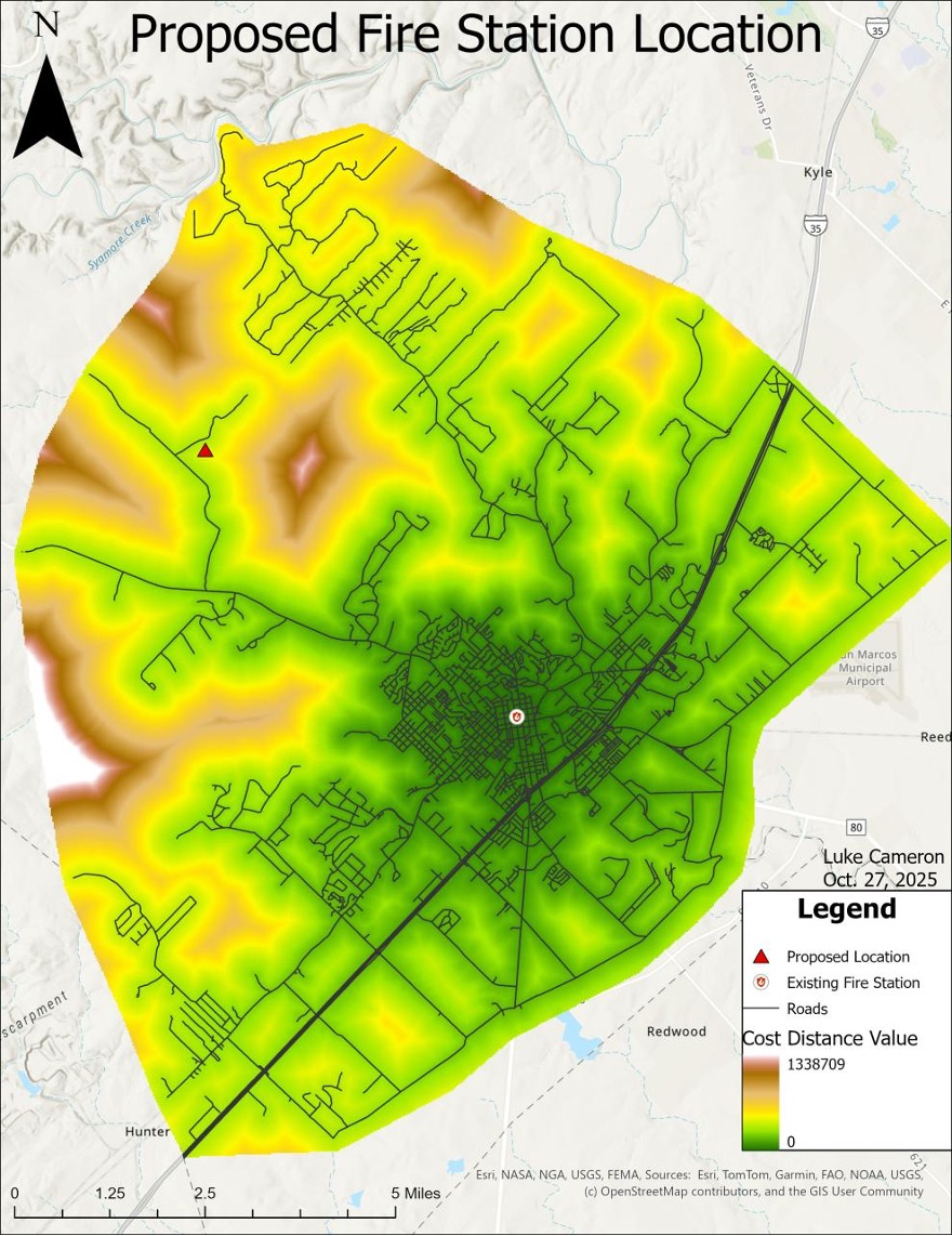
This analysis was used to propose a new fire station location that would best cover difficult to access locations. The map integrated DEM/slope, vegetation, and Euclidean road distance to create a least cost distance analysis. Areas with a higher cost value are time consuming to reach from the existing fire station. |
| Solar Mini-grids in Ethiopia | |
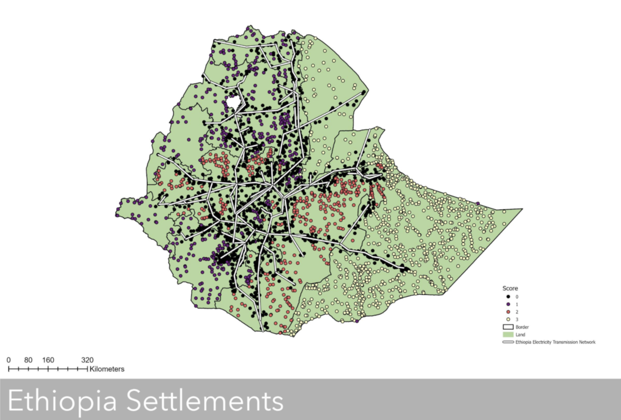 |
This was created for my Energy Resource Management class as the final project. My project identified areas most in need of financial support for solar technology installation due to several factors, including distance from the grid and poverty levels. The dots are settlements in Ethiopia, color coded by their ranked difficult of solar installation. The white lines are the transmission lines of Ethiopia. STORY MAP LINK |
Maps created with ArcGIS Pro and ArcGIS Online
Wesbite created by Luke Cameron using HTML and CSS